The PnP TaxonomyPicker reusable control doesn’t have a property to let you mark the input control as a required field on a form, but fortunately, this can be easily addressed.
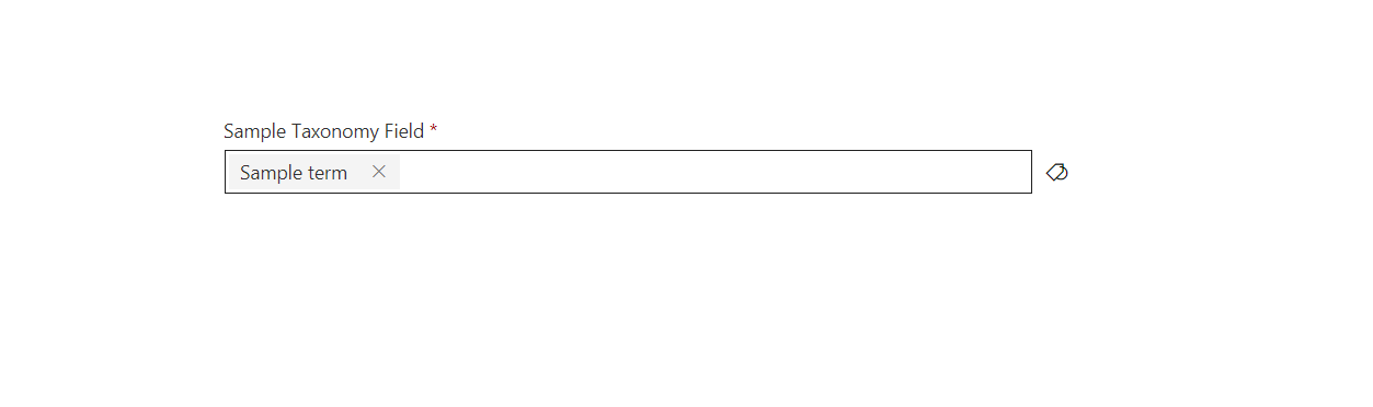
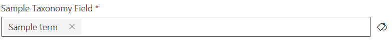
If you have used the PnP TaxonomyPicker reusable control before, you may have noticed that it doesn’t have a property to make it required, nor does it have a property that lets you add a custom CSS class to it. The problem is that your other required input controls on the form will have a ‘*’ after the label, but not the TaxonomyPicker controls.
But there is a very simple way to solve this because the control also has a Label control, so we can mimic the styles from other Office UI Fabric input controls.
Simply create a new CSS rule that includes a class and targets a label as a child item
.required label::after {
    content: " *";
    color: rgb(168, 0, 0);
    padding-right: 12px;
}
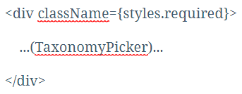
Now add a new element wrapping the TaxonomyPicker (a div, for example)
And now your TaxonomyPicker field will look exactly like the other required fields.
All you have to do now is implement validation.
Setting the field as required may be an option in the near future, but until then, this is a very simple workaround
Are you also using the PnP PeoplePicker control? Then you may want to check this blog post.