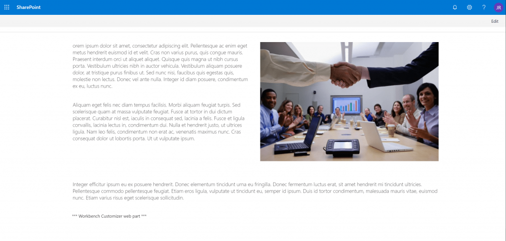
I recently published a blog post about a web part that I use on the workbench page during development. I have this solution deployed on my dev tenant and simply add it to the bottom of the Workbench page. It allows me to work around some workbench limitations when building the UI of SPFx web parts.
I have recently updated this web part and added it to the PnP web part samples project on GitHub. You can get the code here:
/2019/01/18/spfx-workbench-customizer/
The previous version of the web part allowed you to enable/disable specific CSS overrides. Those overrides were dynamically imported on the page based on your settings. When all the overrides were enabled, the Workbench page would have an interface similar to a modern page. For this to happen, the web part would remove extra margins and add extra styles.
Additionally, the web part now also has a switch button to enable page preview mode by default. When this is enabled, right after the page loads, the web part simulates a click on the Preview button at the top of the page and the editing experience is replaced with the preview.
This is really great when testing smaller screen resolutions as the workbench no longer displays a message telling you to “Widen your browser window”. You can see the difference in the images below
Give it a try and let me know if you have any feedback. Happy coding 🙂
