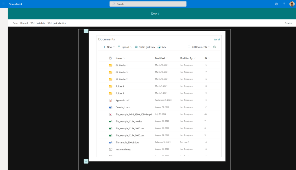
With SharePoint Framework, Microsoft also introduced a really good development story for creating custom web parts: the Workbench page.
This page is not only available when you are developing solutions locally, but also on a SharePoint site. This gives you the option to access data on a SharePoint site from code running on your machine. Let’s be honest, it’s great!
Unfortunately, the Workbench page also has some limitations for some development scenarios. One of them is, in my opinion, how the overall page styles differ from a normal modern SharePoint page.

As you can see in the image above, the styles are really not great. I personally don’t find a reason why they differ so much from a modern page, and why, for example, the page layout is limited to a maximum width of 924px.
When building custom web parts, I had previously (on some occasions) included some code into the project to deal with this in different ways. But this was never a great approach, as I used to comment/delete that code after the work was done…
And this led me to think of a better solution that would allow me to not have to worry about doing it again. So I thought of just creating a web part for it and always adding it to the Workbench whenever I’m working on it.
Workbench Customizer web part


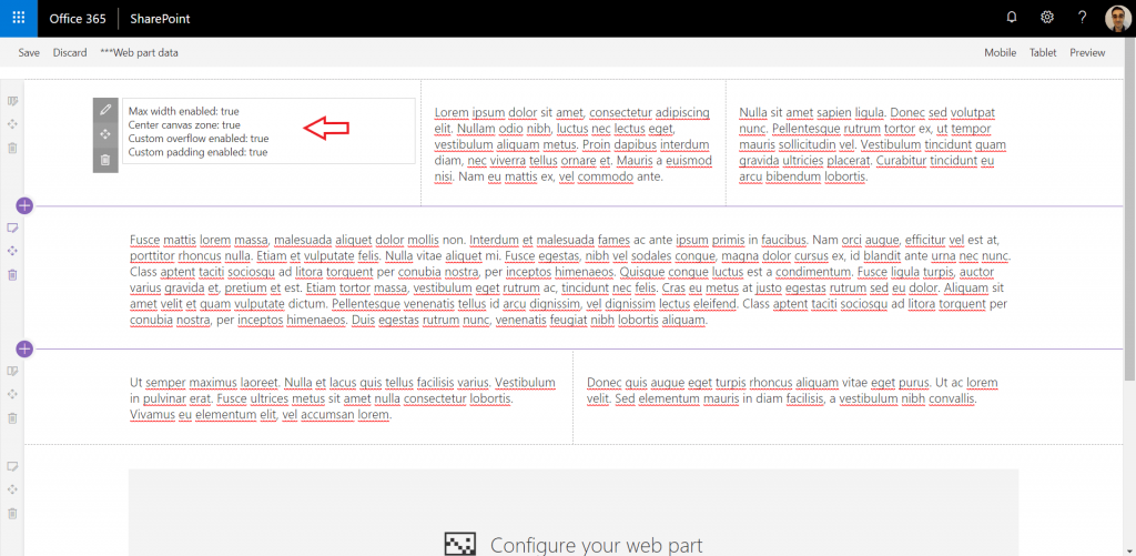
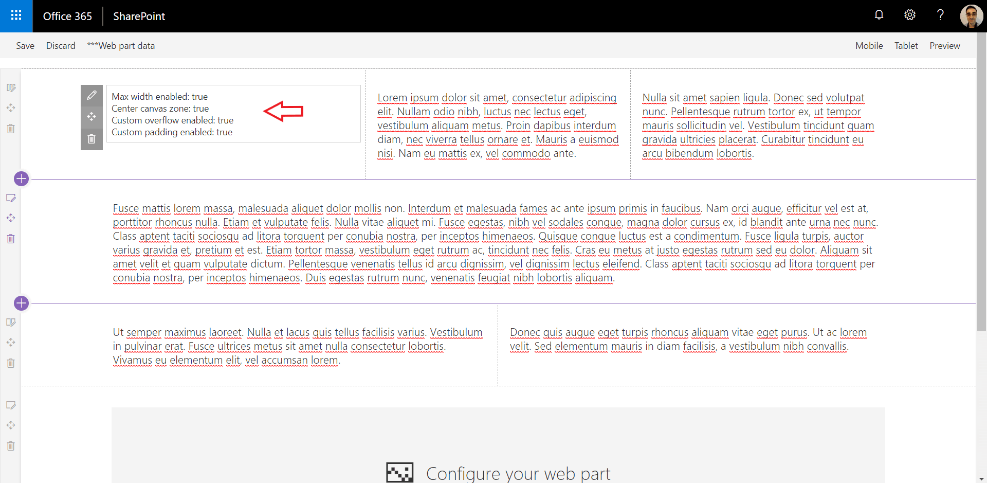
The image above is an example of the workbench page when the web part is added to it (the text on the page is just multiple text web parts to test different zones).
When added to the workbench page, the web part will apply the following changes by default:
- Change the max page width, allowing the editable area to be the same width as a modern page (1236px)
- Center the canvas zones on the page, in line with modern pages
- Update overflow, allowing the scrollbar to appear on the right side of the page
- Remove additional padding that is introduced by having the page in edit mode by default
Each of the items above is controlled by a web part property that can simply be disabled on the web part properties panel. This is currently achieved using dynamic imports. Every customisation is kept on a separate SASS file that is dynamically imported when the property is enabled. When a property is disabled, a message will be displayed asking you to refresh the page.
I will be looking at improving the experience over time, but it does its job at the moment…
Global CSS overrides? Is this not bad?
The CSS changes to the overall page are done using the :global approach. I absolutely know this is not a recommended approach for customising SharePoint, but remember that we are only customising the Workbench page! Who cares! If it breaks, you can simply take it off the page…
Code
The web part is obviously open-source and is currently on my personal GitHub accounthttps://github.com/joelfmrodrigues/spfx-workbench-customizer
I’m planning on submitting a PR to the PnP web part samples repository over the next days and will update the post if the PR is accepted.
Update: The web part is obviously open source and is available under the PnP web part samples repository.
If you have any ideas on things that may be missing or any feedback about the current implementation, please reach out. Any feedback is welcome.
Hope you find it useful and use it while building your own web parts.
I have published another blog post with an update. You can read more here: SPFx Workbench Customizer update

Hi Joel, how do you add this webpart to an existing project so that it can be selected in a local workbench? Is it for instance possible to just copy the .sppkg file?
Hi Ronald, I don’t think this is a possible scenario. It’s fine if you use the online workbench as you can just deploy the solution to the app catalog, but clearly not an option for local workbench. I tend to use the online workbench all the time and din’t thought about this limitation. Will think on a better solution to be easily used on both scenarios.
One option could be a simple SASS file (with all the customizations) that just gets dynamically imported on the web part init function if you are running locally. Thanks a lot for the feedback.